Shadows and reflected light

IMG_2167

This was my attempt at drawing shadow and reflected parts of two objects put together. I felt quite pleased with the final outcome. I enjoyed drawing this however I struggled slightly on the form of the jug. I think my perspective was slightly off and I wasn’t able focus on this so much as I was concentrating on tone. I find drawing a challenge and I like to work quickly. Once I had got the main structure of the objects on the paper, I was able to move more freely with the charcoal. I hope to improve my drawing skills throughout this unit.

Artist Research: Odilon Redon

Born – 1840, Died – 1916. Symbolist painter and printmaker. Born in France.

All of his work is full of mysteries. His style creates a real frightening and disturbing scene. His style has captivated me


Redon_crying-spider
Fig 1. The Crying Spider (1881)


His small areas of highlights make you look deeper and closer into the drawing. I.e. the tear on the spiders face is so small you can hardly see it but look closer and it actually stands out as it is the lightest part of the face. The fact that it is a human face adds to this mysterious and haunting feeling the the image creates. The idea of the tear presents a sad meaning to this drawing. The eyes are completely black and the only thing giving us an indication of what emotion is being portrayed is the tear. The body is pure black and given a fury type texture as the edge of the black is frayed and not a strong neat line. The background tone emphasises a frightening and haunting effect for the viewer as it is light and soft. The background tone looks as it it has been executed using charcoal on its side as it creates a smooth effect on the paper. The charcoal has been using solidly for the spiders body. If we focus on the atmosphere the tone creates I would say daunting and saddening for the viewer. The spider is also personified by using the human face so the viewer almost relates to the image even more


77751_430244
Fig 2. Frontispiece for Les Flambeaux Noirs by Emile Verhaeren (1890)


All emotion, all sense of life is taken out of these images, or more likely they were never put in. Looking simply as the work I feel that I am squinting to work out what I can see and what is put into the image. There is strong mark making that is used to create a striking dark shadow in the middle and edge of the drawing, that dominates the piece. You can make out that there are some figures in the left hand corner of the drawing but it is too dark to see. I think this is what the artist wants. Redon doesn’t want you to know what these figures are, he leaves us guessing and questioning the image which adds to the frightening atmosphere that is created in this drawing. The use of mark making with the dark shadow in the middle creates a sense of movement as the cross hating becomes less dense and the shadow fuses into light. Again this itself creates mystery as the shadow itself blends into the rest of the picture creating a puzzling thought process for the viewer

redon.cactus-man
Fig 3. Cactus Man (1881)


I have started to notice that on the faces of his pictures there are varied tones to make the impression of facial features. Again in this drawing Redon has used darker tones for the eyes which really creates a sense of horror. He has used nark making well to create the bar with varied shades of tone with darker tones in the middle to emphasise the effect of the cactus spikes. The cactus spikes are all over this persons head and neck and are executed using dark but feathery lines. The marks however do not seem strong or harmful as cactus’s are. However some cacti have very small and almost invisible spikes, and I think that these were the thoughts of Redon when he created this image. I think this image is probably more sensitive than what is first seen. His images are dark but I think may be misinterpreted at times.

Figure 1. Redon, O. (1881) The Crying Spider [charcoal drawing] At: http://cargocollective.com/Kunstkabinett/Noirs-by-Odilon-Redon (Accessed on 27 March 2016)

Figure 2. Redon, O. (1890) Frontispiece for Les Flambeaux Noirs by Emile Verhaeren [lithograph] At: http://cargocollective.com/Kunstkabinett/Noirs-by-Odilon-Redon (Accessed on 27 March 2016)

Figure 3. Redon, O. (1881) Cactus Man [charcoal drawing] At:  http://www.artic.edu/aic/collections/artwork/79504 (Accessed on 27 March)

Artists that use marks/lines/textures

I feel at this point is would be good to research into how artists convey textures, as I struggled creating a texture myself. I’m hoping this may inspire me to be more relaxed in the way I work as well as researching how other artists engage in their work. I think it is also important for me to not think too much about conveying the appropriate image and concentrate on the textures.

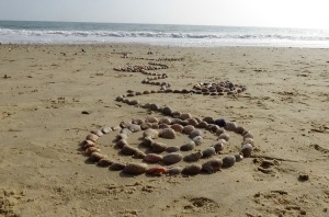
I found information on the meaning and significance of lines and marks that children make and how you can unravel these lines to understand the feelings and thoughts of the child. This really interested me, as ultimately I would love to find my way into art therapy. The article/information leaflet is called: Mark Making Matters. Young children making meaning in all areas of development. ‘scribbles are products of a systematic investigation, rather than haphazard actions’ – John Matthews (1999). The article mentions that when children realise that marks can be used to represent feelings they begin to use those marks to make their thinking visible. Children will make marks for various different reasons, wether it is for development along their journey or sometimes just for the pure physical enjoyment of the activity. With children using various media such as; chalk on a blackboard, or glue oozing through their fingers, they are simply enjoying the physical activity, exploring their sense and growing in confidence as they create these marks. They have no interest in the end product. At other times children may take delight in using their mark making to tell stories and express their feelings. A single drawing may help a child develop concepts relating to problem solving, such as numeracy or spellings. (The national strategies, early years. First published in 2008)

I was really intrigued by this article. I found this especially related to the making marks with emotions activity. I find that creating a mark that has an underlying meaning that is not yet exposed or discovered is exciting and that was how I felt when creating the marks with my emotions. I have found since doing the other exercises there is much more to creating a mark than just a line on the paper. I want to explore this and take this way of thinking when drawing and mark making. I feel that there would be a great deal of development taking place within a drawing if these are consciously thought about. But there is also subconscious, whether you are enjoying what you are drawing or not. I feel really excited to explore the notion of creating art with marks and lines and believe that this approach could result in interesting and meaningful pieces of art being produced not only by children but by adults and experienced artists also.

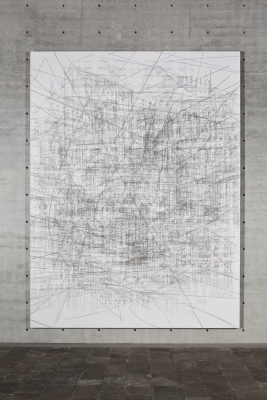
I came across a new artist that works with marks in a very expressive way. I find her work very intriguing and full of movement. Her name is: Julie Mehretu. She lives and works in New York.

She makes large scale, gestural paintings that are built up through layers of acrylic paint on canvas overlaid with mark-making using pencil, pen, ink and thick streams of paint. Mehretu’s work conveys a layering and compression of time, space and place and a collapse of art historical references, from the dynamism of the Italian Futurists and the geometric abstraction of Malevich to the enveloping scale of Abstract Expressionist colour field pertaining. In her high worked canvases, Mehretu creates new narratives using abstracted images of cities, histories, wars and geographic with frenetic mark making that for the artist becomes a way of signifying social agency as well suggesting an unravelling of a personal biography. Her points of interest are architecture and the city, compressed and densely populated urban environments of the 21st century. Her canvases overlay  different architectural features such as columns, facades and porticoes with geographical schema such as charts, building plans and city maps, seen from multiple perspectives. Her paintings present a tornado of visual incident where gridded cities become fluid and flattened, like many layers of urban graffiti. Mehretu has described her rich canvases as ‘stop maps of no location’, seeing them as pictures into an imagined, rather than actual reality. Through the noise of the marks, her work seems to represent the speed of the modern city depicted, conversely, with the time aged materials of pencil and paint.

2ba3e8a1fc3fbce2fb17cc8f8718ef50_0

Kabul 2013. Graphite and acrylic on canvas. Photo: Ben Westoby

77c8a75c0e137d5e1dfbcbba560845e2_0

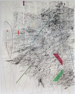
Mogamma: Part 1 2012. Ink and acrylic on canvas.

16a8fbb687e1d799e2ce119732780050_0

Aether (Venice) 2011. Ink and acrylic on canvas. Photo: Francesco Allegretto

http://whitecube.com/artists/julie_mehretu/

Creating shadow using lines and marks

I found this task a challenge. I struggled to make the object I chose look 3D. My mark making was all very similar and I wasn’t sure what the task was actually asking of me. I tried to use various marks but I felt restricted with the amount of creativity I could experiment with. The focus of the task was to create shadow using marks. I felt I tried my best however I didn’t create many varied marks. The task instructed you to not focus too much on the form of the shape. In one drawing I didn’t even draw an outline so I could just target the task of creating shadow. I think ultimately I found this task a challenge once I ad completed it as I wasn’t pleased with the outcome I had created. However I do think that the one where I used circles to create shadow worked rather well.

Tonal Drawing

IMG_2094

This is my tonal drawing of 2 objects. I set up the still life using a spotlight. These objects are the same, one smaller than the other however and both are very reflective. I found this much more enjoyable than completing the ‘groups of objects’ drawing. I found producing this drawing was a faster process and a more expressive way of working which I enjoy more. I like the expressive use of lines and marks when using charcoal. Although I had to get the shape of the objects right the focus was on executing the shadows and the highlights using charcoal as the medium. Again I was apprehensive taking on this task but I have surprised myself with the outcome.

Experimenting with texture

I tried to imitate various textures from various materials. The first material was bubble wrap. I found it hard to create the creases and light reflection of the bubble wrap. I used a rubber to highlight areas and smudging to emphasise the smoothness of the material. I’m not sure that I created an effect that reproduced the true texture of the material. I found this task a real challenge to transfer what I saw and felt onto the paper. I used a fine liner to create marks to replicate the creases in the plastic bag, which I then attempted to produce a pen and water wash however the pen did not run. I decided to add ink to create the ‘flow’ of the plastic as it is a thin, flexible material. I’m not sure that this worked together, however if the ink was black (the same as the pen) it would have created a simpler, clean and plain effect which would resemble the properties of the plastic bag. The only part I was pleased with was the square I have covered with pink ink. I was creating a texture to duplicate curtain fabric. I used black biro to construct and design the raised textures within the fabric and then completed the texture using ink to imitate the smoother surface. Overall I did not enjoy this as much as I hope to when it comes to completing the frottage exercise. I feel that I will be more creative and looser in my thoughts and processes with frottage than I have been when trying to recreate textures of what I see and feel.

Groups of objects

IMG_2092

Before I started this piece I was very apprehensive as I find observational drawing hard. I wanted to make this drawing quite expressive with the marks I use and try to develop a style for me as an artist. I found this really challenging to complete. In the exercise you are asked to try and see ‘through’ the objects which I tried to do. I’m not sure how I feel about this piece…

Making Marks -Exercise 2

ANGER:

While creating these marks I felt a sense of immediacy to get my feelings down on the paper. It was frustrating using the materials themselves, which added to this sense of frustration and feeling of creating a mark right at that time.

I used charcoal for the first square to create a strong, stiff line however using the charcoal was frustrating in itself as it kept breaking. I felt the broken off bits of charcoal added to the effect so I decided to photograph the marks with the broken bits still on the page. Ink was the next medium I used. I found that the ink came out all at once on the first squeeze of the pipet due to my sense of desperation to create a mark on the page. I feel this imitated anger. I used an oil stick, hoping to create an imitation of the charcoal however it was too much of a slow process creating these thick lines which lead me to adapt my marks and I created a stippling effect. I think these marks were quite simple although it meant that it reflected the ‘blunt’ emotion of anger. My last medium I chose was pencil. This was just a simple medium to chose although I felt that could be a challenge in itself. I decided to use a light pencil rather than a heavy pencil to test the pressure of the mark that I could create. Again this was a very quick process which I feel reflected anger well.


CALM:

It’s strange how making a mark can make you feel a certain way…

I smudged the charcoal to make a softer line. It almost felt like if the mark was to be a noise it would be a tiny whisper. The oil bars were used but were hard to create a soft line as it a very hard material to use as it creates very dense marks. However, again I found myself smudging the marks to create a softer edge to the lines. The ink was another obstacle which I found very difficult to control. I had little control of the amount of ink that came out at any one time from the pipet. I had to work very slowly and learnt to keep the marks short. The fainter lines work well but the dollops of ink take away the calmness of the piece. Pencil, this time a harder pencil (opposite exercise to what I did with anger), a 6B. A few questions were raised once I had made the marks and discussed them with my partner… Emptiness? Weightlessness? Simple?


JOY:

As I was conducting this emotion I almost felt as if the marks were dancing. There was a lot of movement going on in my wrist/hand/fingers which in turn lead to the medium imitating this movement on the paper. I feel that there is a lot of excitement in the ink square as the ink has various properties, such as; thick & thin lines and ‘splatters’ of ink with the burst of the pipet. I used the charcoal quite softly but made more of an impression on the paper than I did for calm. I think the most exciting marks however were created with the oil bar, which surprised me. The variation of the more solid marks and the ‘feathery’ marks created some sort of rhythm which I also felt in my hand when making the marks. The fourth medium I used pencil. I varied the heaviness of the pencils this time, combining a 6B with a H. This was to create varied marks and build up the excitement that I think the emotion ‘joy’ contains.


FEAR:

I chose fear for my final emotion. I chose this because I feel this is a very powerful emotion and can stop people doing things. This is also an emotion that I am currently challenged with a lot at this point in my life. I think that fear is a very repetitive emotion that has a lot of loneliness attached to it. With the charcoal I have tried to convey this feeling of loneliness creating a lot of negative space with the image being restricted to a tight round shape that when you experience this emotion it consumes you. With the ink I have used this tool to imitate repetition again in a spiralled manner creating a sense of chaos & panic, but ending up in the same movement, and as such the same situation. The oil bar was harder to control creating larger and more unproductive marks. As I was creating this mark I felt that the shape was going to overlap the other square. I consciously decided to make this happen and to ‘take over’ the other square as I believe fear can be a domineering emotion. Pencil created a more chaotic mark stemming from one point i.e. one thought and unravelling into something fearful.